

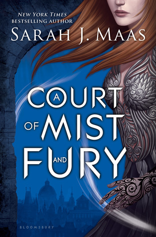
The cover for A Court of Mist and Fury by Sarah J. Maas was finally released a couple of weeks back and I thought I do my first cover reveal discussion post! So without further ado, let's get into it!
Feyre survived Amarantha's clutches to return to the Spring Court--but at a steep cost. Though she now has the powers of the High Fae, her heart remains human, and it can't forget the terrible deeds she performed to save Tamlin's people.
Nor has Feyre forgotten her bargain with Rhysand, High Lord of the feared Night Court. As Feyre navigates its dark web of politics, passion, and dazzling power, a greater evil looms--and she might be key to stopping it. But only if she can harness her harrowing gifts, heal her fractured soul, and decide how she wishes to shape her future--and the future of a world cleaved in two.
With more than a million copies sold of her beloved Throne of Glass series, Sarah J. Maas's masterful storytelling brings this second book in her seductive and action-packed series to new heights.
There's the cover in all it's beauty! For those of you who haven't heard of this book, it's the second book in The Court of Thorns and Roses series by Sarah J. Maas who also happened to write (and is still writing to my knowledge) the Throne of Glass series.
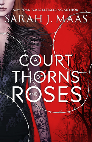
Here's the first cover of the series:
So the cover! Honestly, I'm not totally wowed by it although there are some things that I do like. Let me tell you why.
1. The color. One of the things I do like about this is the color. I love the blue and I think it contrasts beautifully with the red of the first cover. Also, I love the connection to the story line and how in the this book (according to the blurb), we're going to get into more politics and shady stuff which translates to the color of the cover. Where the first one was a bright red for the violence and blood that would be shed, this one is a darker blue that seems a bit more mysterious and likely reflects the plot.
2. The recurring themes. This cover has the same swirly armor and same sort of character silhouette (meaning we don't get to see her eyes and we see about half of her body). There is also some background like the first cover although it isn't too overpowering. This makes me really happy because I hate it when the covers are changed halfway through the series! I'm looking at you Immortal Rules...
3. The wind and the hand. This is one of the parts that I'm not particularly sure about. Her left hand just looks overly cartoonish to me and it looks like it was added in and doesn't really belong. Which kind of makes sense because it wasn't included in the European cover:

Her hand just doesn't blend well in the US cover at all to me. Also, the wind that was included in the US cover but not in the European one is slightly out of place as well. I can't help but notice that one of the wind motions passes across her ring finger which makes me believe that there will be a wedding but that could just be me.
4. The background. I can't decide if I like the city background in the US cover or the plain background with the barbed wire like what was in the first cover in the European cover. I really like the city because of the connection to the first cover (there are the trees on the the right side) and how it reflects the plot. However, I also really like the connection of the barbed wire although I'm not sure how much of that goes with the plot. The US cover in general seems to fit the title and the plot better.
Overall, though, I think my general feeling is that I like it. I still like the first cover so much better though. Do you have a preference between the new and the old? Or the US and the European?

No comments:
Post a Comment