50/50 Friday is a meme hosted by Carrie @The Butterfly Reads and I and focuses on the opposite sides of books (best/worst, differing opinions, etc). Every week will have a new topic and several advance topics will be listed in the tab labeled 50/50 Friday!
Today's Topic: Favorite/Least Favorite Movie Tie-In Cover
Favorite:
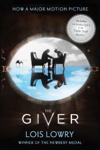
The Giver #1
Blurb:
""I have great honor," The Giver said. "So will you. But you will find that is not the same as power."
Life in the community where Jonas lives is idyllic. Designated birthmothers produce newchildren, who are assigned to appropriate family units: one male, one female, to each. Citizens are assigned their partners and their jobs. No one thinks to ask questions. Everyone obeys. The community is a world without conflict, inequality, divorce, unemployment injustice...or choice.
Everyone is the same.
Except Jonas.
At the Ceremony of Twelve, the community's twelve-year-olds eagerly accept their predetermined Life Assignments. But Jonas is chosen for something special. He begins instruction in his life's work with a mysterious old man known only as The Giver. Gradually Jonas learns that power lies in feelings. But when his own power is put to the test—when he must try to save someone he loves—he may not be ready. Is it too soon? Or too late?"
This is seriously one of the best onion books I've ever read and I love how the cover shows that! I adored both the movie and the book. The whole story is about recognizing that with beauty comes pain and the pain is worth what you gain. Jonas is shown the difference between the two worlds by The Giver and that's perfectly showcased on this cover. The movie has beautiful imagery that's been pulled from the book and it's gorgeous! I've thought about buying this edition of the book even though I already have an older copy with the original copy just because I love the cover so much.
Least Favorite:
I actually have two for this section but they fall under sort of the same category for covers in general that I just can't stand anymore.
Standalone to date
Blurb:
"It is 1939, Nazi Germany.
The country is holding its breath.
Death has never been busier,
and will become busier still.
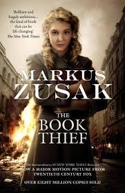
By her brother's graveside, Liesel's life is changed when she picks up an object, partially hidden in the snow. It is The Gravedigger's Handbook, and it is her first act of book thievery.
So begins a love affair with books and words, as Liesel learns to read. Soon she is stealing books from Nazi book-burnings, the mayor's wife's library, wherever there are books to be found.
But these are dangerous times. When Liesel's foster family hides a Jewish fist-fighter in their basement, Liesel's world is both opened up, and closed down.
Award-winning Markus Zusak has given us one of the most enduring stories of our time."
This is one of the best books I've ever read as well but they fell into the trap of having a person in front of some dramatic scene on the cover. Not that I don't like people on the cover, it's just that it's so boring and it doesn't really tell you anything about the underlying themes which doesn't do this story justice because it's such a lovely onion book as well (the themes of death and life are definitely my favorites). I realize that they generally have to do some sort of person-cover for movie posters but when it comes to the book cover, maybe pick something a little more representative!
The Host #1 (although who knows when the next book is coming out... it's basically a standalone)
Blurb:
"The phenomenal #1 bestseller is now a major motion picture: "Startling and addictive. . . . An epic story of love, family, and loyalty." -USA Today
Melanie Stryder refuses to fade away.
Our world has been invaded by an unseen enemy that takes over the minds of human hosts while leaving their bodies intact. But Wanderer, the invading "soul" who occupies Melanie's body, finds its former tenant refusing to relinquish possession of her mind.
As Melanie fills Wanderer's thoughts with visions of Jared, a human who lives in hiding, Wanderer begins to yearn for a man she's never met. Soon Wanderer and Melanie-reluctant allies-set off to search for the man they both love.
Featuring one of the most unusual love triangles in literature, THE HOST is a riveting and unforgettable novel about the persistence of love and the essence of what it means to be human."
I did generally like both the book and the movie for this story but again, the cover is just so boring! The only thing that mildly tells you when the story is about is the glowing O which just doesn't help at all. Again, this cover was cheapened and did nothing to allude to the deeper themes (other than this crazy love triangle that isn't really a love triangle). I definitely think this book is so much better than Meyer's Twilight series and that wasn't shown in the cover.
What are some of your favorite and least favorite movie tie-in covers? Have you read any of these books or watched the movies? What did you think? Make a post and link up down below!
Next Week's Topic: Books You Were Early/Late to the Party in Reading


I totally agree with you. The movie covers of The Book Thief and The Host are awful. I guess they figured you already know what the books are about but that’s no excuse. The Giver cover gets it right.
ReplyDeleteRight?? It's fine to have people on the cover but they have to be doing something that relates to the plot or something! The Giver cover is so pretty and so representative as well. Thanks for stopping by, Jenny!
DeleteThe Giver tie-in cover is actually surprisingly awesome! I still haven't seen the movie yet... gotta get to that
ReplyDeleteRight?? I didn't even know what is was until I was looking around at covers for this! I think I'm going to get a copy of the book with the cover because I love it so much. Yes, you must! It's such a good movie. Thanks for stopping by, Wren!
DeleteThe Host is ugly. I agree completely! The Giver is such a good cover! It really fits the story.
ReplyDeleteExactly my feelings! I've been thinking of getting another copy of The Giver so I can own that beautiful cover and see it on my shelves every day. Thanks for stopping by, Carrie!
DeleteLaura @BlueEyeBooks
I had the movie cover for the Book Thief but I had to return it because I hated it so much >:( I just dislike movie covers in general :P
ReplyDelete~ noor / bookmarkd
Oh no! That's terrible. It can be so difficult to make a good movie cover. Thanks for stopping by, Noor!
DeleteI love the Giver! It's one of my all-time favorites!
ReplyDeleteLovely post!
It's such a lovely book! Thanks for stopping by, Caroline!
DeleteI was really irritated by the Still Alice cover. I get that it showed Julianne Moore because she starred in the film, but she looks absolutely nothing like Alice is described in the novel. Very confusing!
ReplyDeleteThat's always so frustrating when the casting just isn't right and they put those people on the cover. It's like the casting people didn't even read the book before casting! Thanks for stopping by, Stephanie!
DeleteOoh you're right, that The Giver cover is so pretty! And I didn't even realize the imagery until you pointed it out. And I agree, "person in front of background" is become overdone and I often find it boring too unless there's something particularly special or extra about it. Or if it's at least illustrated instead of a photo!
ReplyDeleteIsn't it though?? Those are the best covers: the ones that say something about the internal themes.
DeleteIt is really overdone although I know it can be kind of hard to come up with new cover images when it's a movie because you want to feature the actors, but at the same time, have to make it at least slightly stylish and such. Illustrated covers are so beautiful! Thanks for stopping by, Kristen!
I think it would be difficult to do a movie tie in cover for The Book Thief... I still need to see that movie.
ReplyDeleteI definitely don't envy their task but there were also so many other things they could have done with it. YOU MUST SEE IT! Seriously, it's lovely. Thanks for stopping by, Lauren!
Delete