50/50 Friday is a meme hosted by Carrie @The Butterfly Reads and I and focuses on the opposite sides of books (best/worst, differing opinions, etc). Every week will have a new topic and several advance topics will be listed in the tab labeled 50/50 Friday!
Today's Topic: Most/Least Favorite Cover
Most:
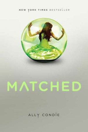
This was such a hard decision! There are so many covers that I love because of either their symbolism to the story, or they're just plain pretty. This cover captures both of those and the covers of the sequential books follow Cassia's (the MC) journey as she finds out what she wants and what her society is like. While the entire series wasn't my favorite, I can't deny that the author/graphic designers did an excellent job.
Least:
This cover I don't really care for. While I did love the story of this book, it isn't really shown on the cover. The cover just looks like every other romance book. Like I said above, I'm really into symbolism on covers. The cover is the place where you pull readers in and give them a glimpse into the story. From this cover, all I see is that there's a romance which doesn't make it special. I just wish there was a unique element that spoke to the story within the pages.
What covers do you love? Which ones aren't your favorite? Do you agree with my picks? Make a post and link below!
Next Week's Topic: Character Most/Least Likely to go Running in Sleet


While I was never a huge fan of the Matched trilogy I always thought the covers were pure genius! I'm with you on the other cover too. Haven't read the book but that cover does nothing for it.
ReplyDeleteMe too! I liked the first book but it just declined after that. The covers are so gorgeous and impactful, though!
DeleteFor sure. I just wish there was something that made it different!
I agree with you on the Wait for You cover- other than it's a romance book, I wouldn't be able to tell anything about the plot from the cover. With Matched (which I haven't read, but I've briefly heard about) I can tell it's a bit more plot-oriented. I like that it's simple, but isn't identical to the dozens of other covers like Wait for you is. I think my favorite cover is Crystal Singer by Anne McCaffrey- it has pastel colors, crystals, a heroine in a strong pose (which is hard to find), and you can imagine a lot of the book just by looking at it.
ReplyDelete~Litha Nelle
For sure! It's just so vague!
DeleteOoo yes that cover is really cool! I also like it when the heroine is in a strong pose and they're not just doing the whole 'wave your arms around your face' thing or just their eye is shown or something.
Armentrout has gotten the best covers has she - I don't really care for the Lux covers.
ReplyDeleteYeah... I also don't like the Lux covers. The redesign is a bit better than the originals but it's still awkward and weird looking.
Delete