50/50 Friday is a meme hosted by Carrie @The Butterfly Reads and I and focuses on the opposite sides of books (best/worst, differing opinions, etc). Every week will have a new topic and several advance topics will be listed in the tab labeled 50/50 Friday!
Today's Topic: Most/Least Favorite Spine Design
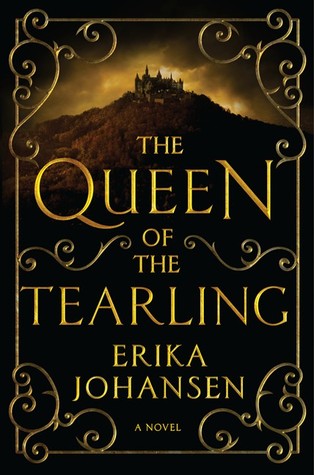
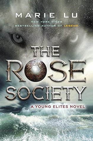
I picked the books based on my most and least favorites on my physical shelves so I own both of these books in hardcover. Spine designs are so often overlooked but they're the first thing you see when browsing through a library or bookstore! It's time they get some recognition!
Most:
This whole series, really, has the most gorgeous spines. I'll put a picture of the spine below so you can really see what I mean. It's just so classy while being totally in line with the time period and mood and atmosphere of the story. I have the hard cover version of the first book (I don't own the second or the third yet but I want to!) and it's just so gorgeous! The dust cover is made of the softer material and you can feel the letters. There's also a ribbon bookmark which totally goes with the book. That's not entire related to the topic but it's part of why I love the outside design so much!
It's the middle book in the pile (found image at sleepy-bookworm.tumblr.com - I wasn't able to take a picture of my copy). Isn't it gorgeous?
Least:
I just feel very meh about this spine design. The cover I can get behind but I don't think the elements were all quite put together for the spine. While I absolutely LOVE both the spine and cover designs for The Young Elites and The Midnight Star (books 1 and 3 of the trilogy), I just don't love this one. The others just had more of a sense of clarity and cleanness with smoother lines and such whereas this one feels a bit blurry and slightly generic. It makes me sad because these are such amazing books!
This is the spine design. I also wasn't able to take a picture of my copy of this book but I grabbed an image off of ebay of the box set. The Rose Society is in the middle.
Do you agree with my picks? What books do you think have the best and worst spine designs? Make a post and link up down below!
Next Week's Topic: Best/Worst Book Read In January


Honestly I don't even notice it think about book spines. I actually am not sure what I think of your favorite. I don't like how it breaks up each word in the title. Hmmm. Maybe I'm a spine snob. ;)
ReplyDeleteHaha well we each have our own preferences! I mostly like it because it looks like an old timey book and it really fits with the story.
DeleteYou're right about The Rose Society, it just doesn't quite stack up to the two others in the series.
ReplyDeleteYeah... And it's so sad because the books are so good!
Delete