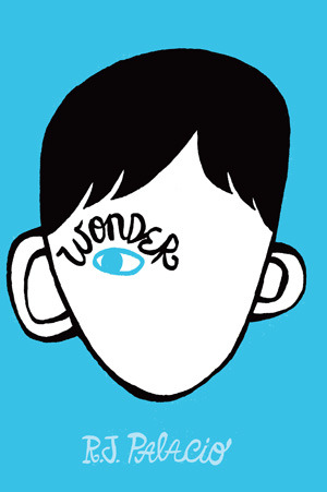
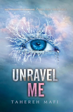
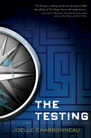
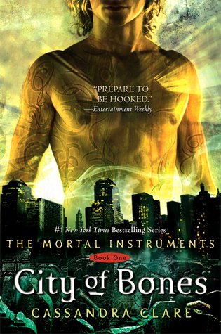
The number one thing that catches my eye while I'm browsing the shelves are simple but sort of abstract drawings or images. Here are a few examples:
I don't know what it is about them... maybe that you see that symbol and immediately wonder how it relates to the book and pick it up to find out!
On the opposite side of that is that I don't like covers that are too busy. Here are some examples:
Not that these are bad books, just that I don't particularly like their covers. They're just a little too busy and don't really say too much about the story at a glace or contain much mystery. Either that or they're all just... meh. Yes, I don't like The Hobbit's cover but I do like the paperback versions of the Lord of the Rings series where they just have a simple ring in the middle of a black cover. I'm much more intrigued by those kinds of covers and they look a bit prettier to me on my shelf.
Do you prefer real or computer generated images on covers? Do you like simple covers better?
The cover is one of the most important aspects of the book because it's the first thing a person sees. If they don't like the cover, well there's a reduced chance that they'll actually pick up the book to read the blurb.
One other thing I really appreciate with covers is if they actually relate to the book in some way. Here are a few examples of what I mean:
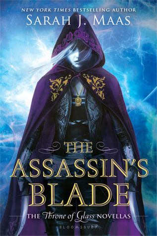
These are all such beautiful covers and they relate so closely to their respective books. Cinder is all about a cyborg - hence the metal bones - and is modeled after Cinderella - hence the glass slipper. As for The Boyfriend App, there's an actual picture of the app. For Bitterblue, those are the keys Bitterblue finds that start to unlock the truth in her castle. And finally for the Assassin's Blade, the cover depicted Celaena, hooded and dangerous, as Adarlan's assassin. These, in my opinion, are the perfect covers.
What are some of your favorite covers?








I definitely like covers that are more ambiguous too! I tend to dislike covers where you can clearly see the model's face, because I feel like this interrupts my ability to create my own mental image of the characters (like with the Bloodlines series- I haven't read it yet but I feel like the models are so in your face).
ReplyDelete-Cristina @ Girl in the Pages
Yes! Then I had a totally screwed up image of Sydney! When I read about her in Vampire Acadmey, I pictured her totally different than how the model looked even though they did an okay job picking a model. Not being able to see their face adds to the whole individuality thing that comes with reading a book. I hope you do like it when/if you read it!
Delete